Why a small mark in the corner of our site carries more weight than most logos ever will.
By R. Bradley Thompson | April 29, 2026
About one in four adults in this country lives with a disability. That’s roughly 70 million people who try to navigate the websites the rest of us take for granted, only to hit a wall. A button they can’t see. A form they can’t read. A menu a screen reader can’t decode.
That is who I think about when I do this work.
In the accessibility space, we don’t usually call ourselves first responders—that term belongs to the people who run toward the fire. But there is a piece of that idea that fits. When a digital gateway fails the people it was built to serve, someone has to show up. Not after the lawsuit. Not after the complaint letter. Before. That is why we built diigiital. And that is why we created the Digital Shield.
The Anatomy of the Mark: Intentional Geometry
I want to walk you through what the shield means, because we spent weeks on the reasoning before we ever touched the geometry.
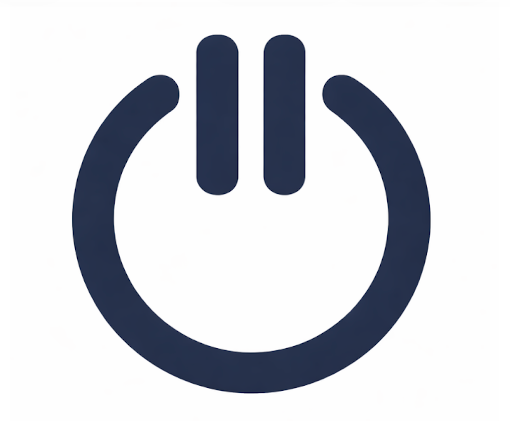
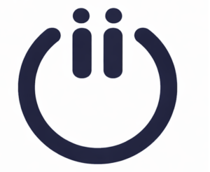
The base of the design is the universal power symbol. Most people have pressed it ten thousand times without a second thought, and that’s the point. Accessibility shouldn’t feel like a “special feature” you have to hunt for; it should feel like the act of turning the lights on.
We took the single line at the top of the power button and split it into two. From that core idea, we developed two distinct variations:
- The “II” Variation (Uppercase): Two clean vertical bars representing Title II of the ADA. This is our mark for the public entities—the school districts, hospitals, and governments that serve everyone by default.
- The “ii” Variation (Lowercase): This represents Title III for private commerce. But the lowercase “ii” carries a deeper meaning: two equal letters, two equal voices, two people in conversation. This mirrors the double “i” in the diigiital name. It’s how we work, and it’s who we are.
Form Meets Function: The Living Logo
The shield isn’t just a static graphic; it’s a functional tool. On diigiital.com, the logo serves as the live toggle for our accessibility widget. Click the power button in the upper-left corner, and the Shield opens the controls to resize type, adjust contrast, and highlight links.
The design challenge was making the mark behave like a button while reading clearly at any size—from a hero image to a 16-pixel browser tab. We went through dozens of versions to ensure the “Digital Shield” could do its job, not just stand for it.
A Note on Risk: The First Step, Not the Last
The line between confidence and oversell in this industry is thin. I want to be clear: A logo does not make an organization compliant. Real accessibility is a habit, not a moment. The Digital Shield is a “first line of defense.” It signals that you’ve shown up. It says someone on your team is finally paying attention. It is a vital first step, but it isn’t a finish line—because in accessibility, there isn’t one. I’d rather tell you that now than have you find out later.
For the Record
The Digital Shield went live in April 2026 in both its uppercase “II” and lowercase “ii” variations. It is the original work of R. Bradley Thompson and diigiital.
Every element described here—the dual Title II/III metaphor, the lowercase “ii” as equal partners, and the functional integration as a digital toggle—was a deliberate creative choice. I am putting this on the record today, April 29, 2026, to reflect exactly what we built and why we built it.
There are 70 million people in this country who deserve a digital experience that works. We made the Digital Shield for them.
Real Standards. Real Impact.